What is a Pareto Chart?
A Pareto chart combines a bar chart and a line chart. The bars represent a value associated with each category (e.g. number of sales per product). The line shows the cumulative contribution of each category to the total — starting from the largest contributor and building to 100%.
The chart is rooted in the Pareto Principle (the 80/20 rule) — the observation that in many systems, roughly 80% of outcomes come from 20% of causes. Pareto charts make this visible, helping teams focus effort on the categories that drive the most impact.
A simple example
Consider this dataset of product sales across 11 categories, totalling 55 sales:
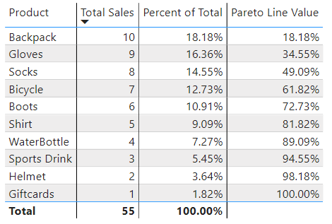
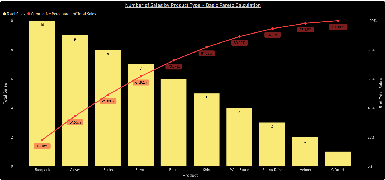
Backpacks contributed 18.18% (10/55). Adding gloves' 16.36% gives 34.55% — meaning those two categories together account for over a third of all sales. Plotting this gives the chart below.
Building it in Power BI
Since Power BI has no built-in Pareto visual, the chart is constructed using a line and clustered column chart, with a custom DAX measure to calculate the cumulative percentage line.
The standard approach found in most guides works by filtering the table to products with at least as many sales as the current product, summing those, then dividing by the total to get the cumulative percentage.
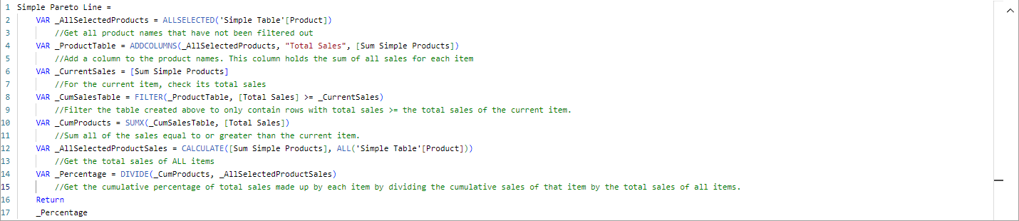
Referenced measure: "Sum Simple Products" is simply SUM('Simple Table'[Total Sales]) — the total sales across all products.
This works well for clean data. But there's a significant edge case.
The Tiebreaker Problem
When multiple products share the same sales figure, the standard measure treats them as a single entity. Because the filter keeps all products with at least that many sales, tied products all receive the same cumulative value — creating a flat line where it should be stepping up.
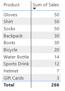
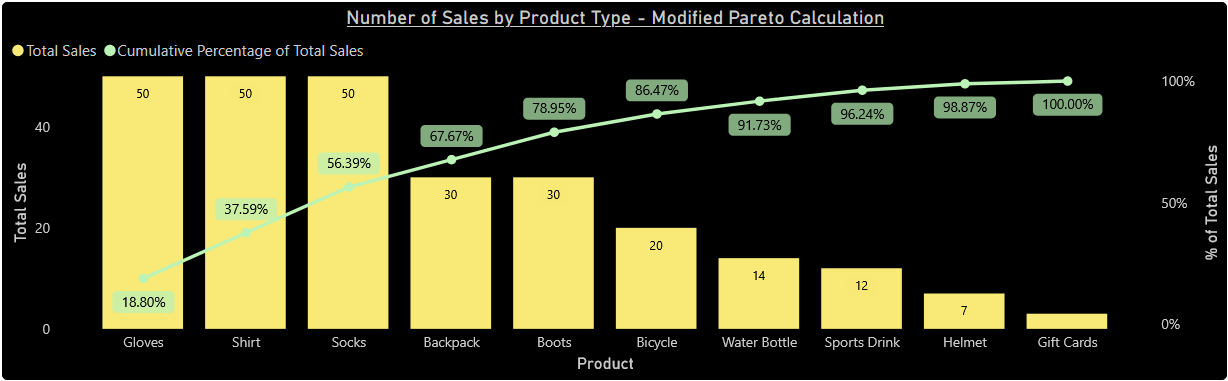
The issue: When filtering to "all products with ≥ 50 sales", the sum across those three products (150) is assigned to each of them individually — rather than treating them sequentially.
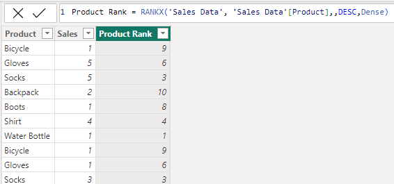
The Fix: A Rank-Based Tiebreaker
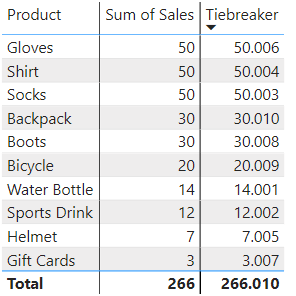
The solution is to add a secondary value that makes every product unique — even when their sales figures are identical. A calculated column assigns each product a rank based on its name in descending alphabetical order.
This rank is then divided by 1,000 and added to each product's total sales to create a unique tiebreaker value. Dividing by 1,000 ensures the added amount is small enough that it doesn't affect the primary ordering — it only separates tied products from each other.
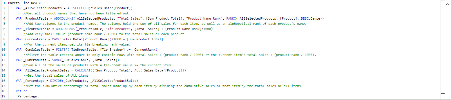
The DAX measure is then updated to use this tiebreaker column in the filter:
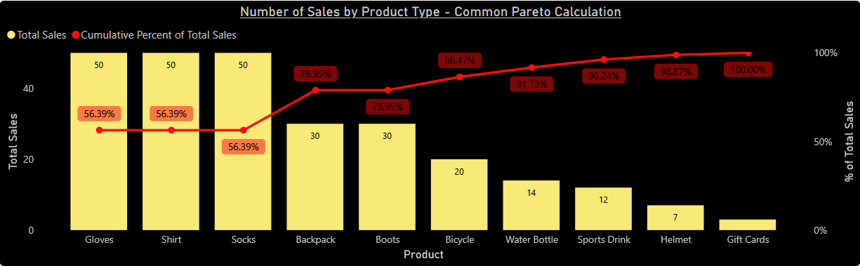
Result
With the tiebreaker in place, every product receives its correct cumulative percentage — even those sharing identical sales figures.
When to use this technique
Pareto charts are one of the most requested visuals in business analytics — particularly useful for product revenue analysis, issue frequency tracking, and any situation where the 80/20 rule is relevant.
The tiebreaker approach is worth building into any Power BI Pareto template as a default, since real-world data almost always contains ties. The rank divisor (1,000 here) should be adjusted if dealing with very small sales figures where the added value could affect primary ordering.