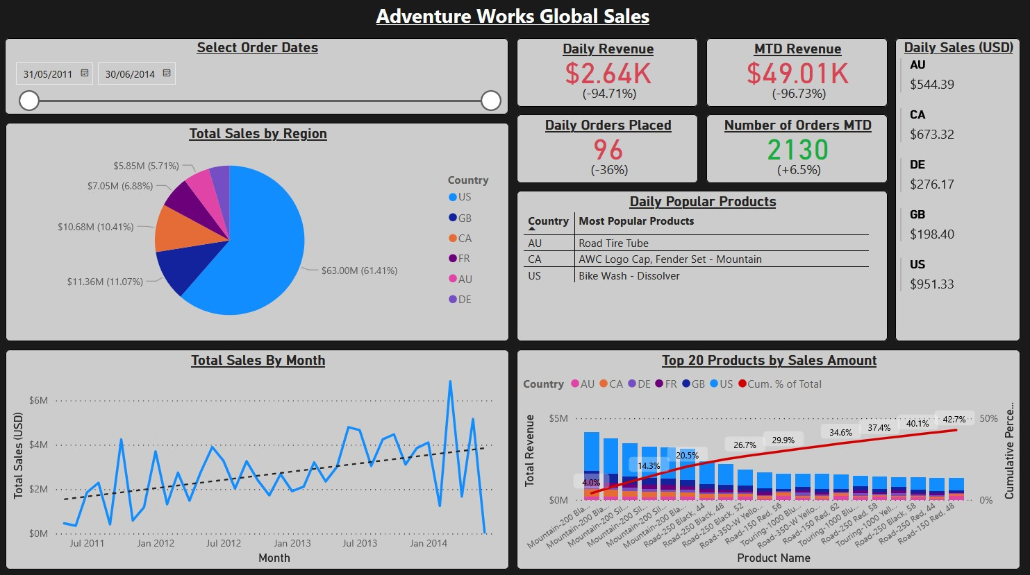
Data Connection & Exploration
Microsoft provides the AdventureWorks sample data as a .bak backup file.
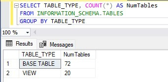
After restoring the database using SQL Server Management Studio (SSMS), the schema
is immediately well-organised — 72 base tables and 20 views, grouped into intuitive
categories like Human Resources, Production, and Sales.
For this report the focus is on sales data, drawing primarily from Sales.SalesOrderHeader and Sales.SalesOrderDetail. SalesOrderHeader aggregates the detail table on SalesOrderID, adding higher-level order information on top.
Currency Conversion
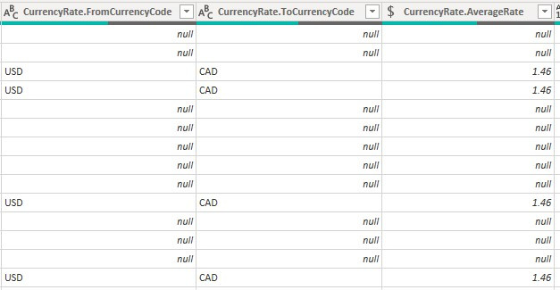
One complication: sale prices are stored in local currency. To compare values across countries, all figures need to be converted to USD. The database includes a CurrencyRate table containing daily conversion rates, which is joined to SalesOrderHeader on both CurrencyRateID and CurrencyRateDate — ensuring the correct exchange rate for each order date is applied.
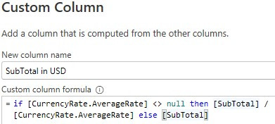
The conversion itself is straightforward: divide the subtotal by the exchange rate, keeping the original value where the rate is null.
Data Modelling
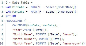
With the data loaded into Power BI, the next step is building a proper date table. Date tables are best practice in Power BI — they allow time intelligence functions to work correctly and provide a clean way to slice data by month, week, quarter, or year. Here the date table is generated in DAX based on the range of order dates in the fact table.
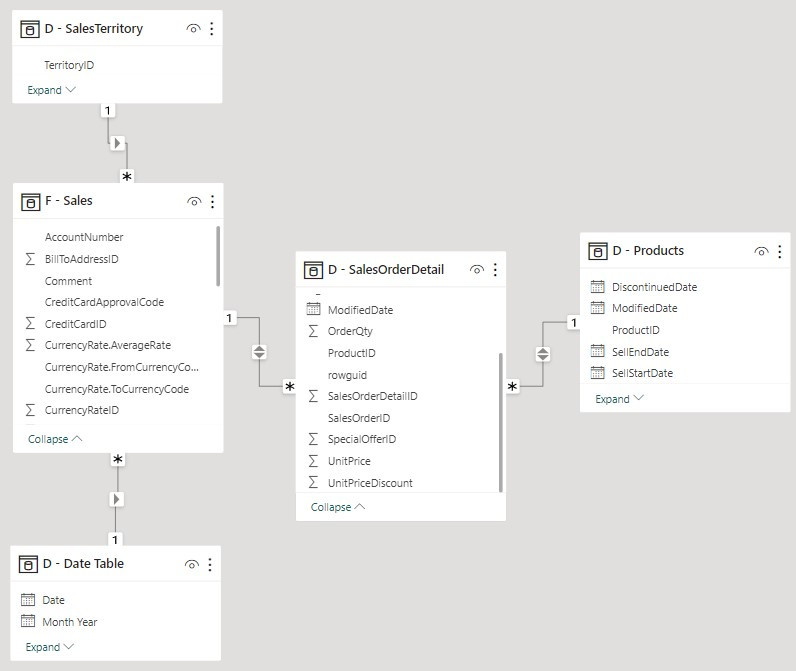
Star Schema
The model is structured as a star schema — the standard Power BI best practice. In this pattern, a central fact table (sales events) is surrounded by dimension tables that describe what, where, and when each event occurred.
Dimension tables are prefixed with D, the fact table with F. The SalesOrderDetail table is treated as a dimension here, as it describes the contents of each sale rather than the sale event itself.
DAX Measures
Most visuals in the report are built by dragging and dropping fields directly. Two visuals require custom DAX measures: the daily popular products table, and the Pareto chart.
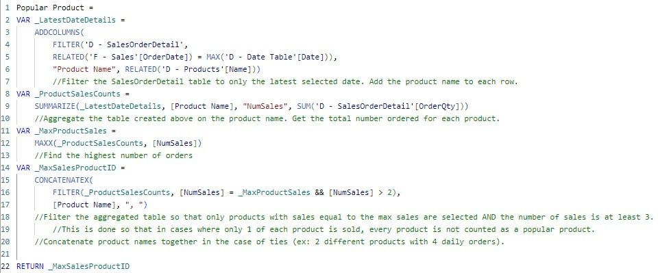
Daily Popular Products
This table shows the most popular products per country on the user-selected date. It requires aggregating SalesOrderDetail to count total units of each product purchased on a given day, filtered dynamically by the slicer selection.
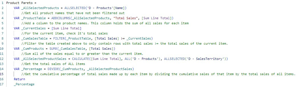
Pareto Chart
Pareto charts are a frequently requested visual — but Power BI has no native way to create them. The approach here uses a line and clustered column chart, with a DAX measure to calculate the cumulative percentage line. The same technique is covered in more depth in the dedicated Pareto Charts guide.
Key Findings
While AdventureWorks is a sample dataset, the report surfaces some genuinely interesting patterns worth highlighting.
What the data tells us
- The Pareto chart reveals that the top 20 products (just 4% of the 504-product catalogue) generate over 40% of total revenue. The "Mountain-200" bike series is the standout driver.
- Total sales trended upward over three years — but the final five months show alarming volatility. March 2014 hit a record ~$7M; the surrounding months were drastically weaker. This warrants investigation.
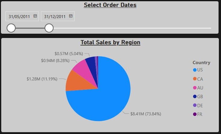
- The US accounted for roughly 60% of lifetime sales, but filtering to earlier years shows an even higher concentration — suggesting AdventureWorks grew internationally over time.